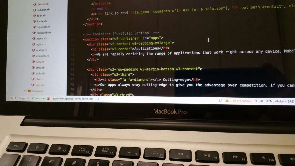
New Year Codebase Health Check: A January Checklist for Development Teams
A practical January checklist for development teams: audit dependencies, target test coverage, prune...


Most design systems start with a colour palette and end with a Storybook full of tidy buttons. Somewhere in between, someone tabs into a modal, gets stuck, and quietly closes the ticket. Accessibility does not have to be a heroic audit at the end of a project. Treat it as part of the component contract, the same way you treat prop names and types, and most of it disappears into the build.
What follows is a practical path for a small React component library styled with Tailwind CSS, where WCAG 2.2 compliance comes from the components themselves rather than from a checklist applied page by page.
If your colours only exist as hex values scattered across components, contrast becomes impossible to audit and expensive to fix later. Start with semantic tokens in one place: surface, text-primary, text-muted, border, border-focus, danger. Name them by role rather than hue, so a component asking for a danger background never cares whether danger happens to be red or amber.
In Tailwind CSS v3 you extend the theme in tailwind.config.js; in v4 you declare the same values in CSS with the theme directive. Either way, map tokens to Tailwind utilities once and use those utilities everywhere. Then check the pairs you actually ship. Body text against its background needs a contrast ratio of at least 4.5:1, large text of roughly 24px (or 18.66px bold) needs 3:1, and non-text elements such as input borders, icons and focus rings need 3:1 against their neighbours.
WCAG 2.2 nudges you on things tokens alone will not solve. Focus indicators must not be entirely hidden behind sticky headers or cookie banners (2.4.11), and pointer targets should be at least 24 by 24 CSS pixels or have equivalent spacing (2.5.8). A 32px icon button is easier to hit with a thumb and easier to hit with a mouse, so it is a sensible default.
Resist the urge to publish twenty components in the first sprint. Button, TextField, Field (label, hint and error), Dialog and Disclosure will cover a surprising amount of a typical product, and each one is easier to get right in isolation.
Two small utilities pay for themselves immediately. Use clsx to compose conditional class names, and tailwind-merge to resolve conflicts so that a className passed by a consumer beats the component's default rather than fighting it. Without that, every override becomes an important flag and your design system starts to feel hostile. Decide how refs are handled too, and keep it consistent across the library, because inconsistent ref handling quietly breaks focus management in the components that depend on it.
A heading component should take a level and render the matching h1 to h6, not pick a tag based on how big the text looks. Decouple visual size from semantic level: a level-two heading with large styling is honest, while reaching for an h4 because it renders smaller is how pages end up with an outline that makes no sense to anyone listening.
The most reliable way to make accessible usage the default is to make the inaccessible version impossible to type.
Focus is the part of accessibility that automated tools detect worst and users notice fastest.
An error shown only as a red border is invisible to someone who cannot distinguish it, and easy to miss for everyone else. Pair colour with text and an icon, and label required fields with the word Required rather than a lone asterisk.
Dark mode is a second theme, not an inversion. Re-check every token pair in it, because a border that reads clearly in the day theme can sit too close to the surface at night. In forced-colours mode browsers discard your backgrounds, so do not rely on a shadow or a background fill to define a boundary. Use a border.
Storybook is a reasonable home for this. Write a story per state — default, hover, focus, disabled, error, loading — and run an axe check against each one in continuous integration. Automated tools catch a subset of real problems, mostly missing labels and contrast failures, so treat them as a floor rather than a finish line. Then do the parts a tool cannot:
Pick Button, TextField and Dialog. Get focus behaviour, labelling, states and contrast right in those three, note the decisions alongside the code, and release them. A small system that everyone trusts gets used; a sprawling one that developers work around teaches people to bypass it entirely.
Grow the library when a real screen needs a real component, and add each new one with the same three questions: what role does it expose, what happens when you tab through it, and what does it sound like when it is read aloud?
Photo: ApexDigitalAgency / Pixabay
A practical January checklist for development teams: audit dependencies, target test coverage, prune...
CSS Grid usually breaks on mobile because of sizing floors, not the grid itself. Here's why implicit...
A practical checklist for keeping personal data out of application logs, setting sensible retention...